
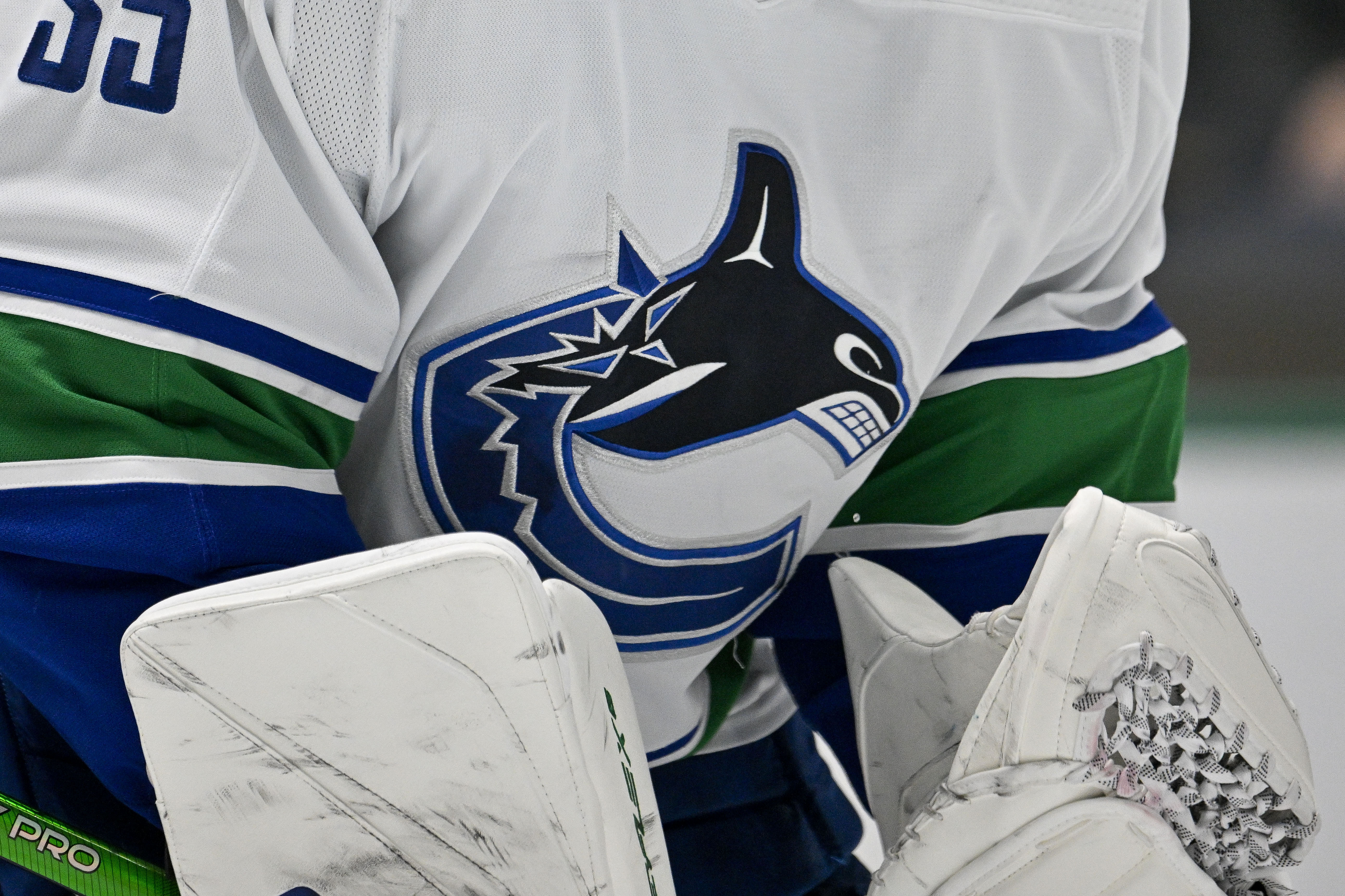
The Vancouver Canucks have introduced a new logo that will be featured at center ice in Rogers Arena for the upcoming season.
This new logo pays homage to the classic orca whale design, incorporating some unique elements. Although the design has sparked considerable excitement, it hasn’t won over all fans.
Several fans shared their opinions regarding the new logo for the Vancouver Canucks.
“It’s cool, but a 20% ticket price increase isn’t justified,” was one fan’s take.
“It’s not the skate,” another fan remarked.
“Just to share: I appreciate the Indigenous Art theme, but the Orca needs to go,” another fan expressed on social media.
Conversely, a segment of fans appeared to embrace the new center ice logo, expressing enthusiasm for the design. These supporters conveyed their loyalty to the local team.
Here are some enthusiastic remarks from these fans:
“Drop the puck. I’m ready,” a fan commented.
“It’s so good,” another fan remarked.
“Looks so clean. Love it,” yet another fan posted.
Fans of the Vancouver Canucks will eagerly await the official presentation of the new center ice design at Rogers Arena on Friday, October 4. Coincidentally, the Canucks will compete against their longtime rival, the Edmonton Oilers.
Anticipations Surrounding Sammy Blais for the Vancouver Canucks
Recently, the Vancouver Canucks signed free-agent forward Sammy Blais to a minor league contract with the AHL’s Abbotsford Canucks.
This agreement also includes an invitation for a professional tryout at the main team’s upcoming training camp. What expectations should the Vancouver Canucks have for Sammy Blais?
The response to this inquiry can be viewed from two angles.
Firstly, Blais is primarily viewed as an AHL player at this time. The Abbotsford team can look forward to acquiring a solid forward in Blais, who is likely to aim for a position in the team’s top six.
In this sense, Blais’ contract appears to be centered on bolstering their AHL affiliate. However, the other side of this signing demonstrates that Blais serves as insurance for the main roster.
While he may be projected as a top-six forward in the AHL, Blais possesses the potential to fit into a depth role for the NHL team, particularly within the bottom six forwards.
A former sixth-round selection of the St. Louis Blues in 2014, Blais participated in 53 games for the franchise last season, recording seven points. Averaging under 10 minutes of ice time per game positioned him as a fourth-liner.
As a result, Blais could emerge as a valuable depth asset, especially if injuries arise within the team. Naturally, there’s no certainty regarding his transition to the NHL, but having Blais on standby to join the big club provides flexibility in the event of injuries or performance fluctuations.
Quick Links


More from Sportskeeda
Edited by Chaitanya Prakash
“`html
Vancouver Canucks Debut New Center Ice Logo Amid Mixed Fan Reactions
The Vancouver Canucks have officially unveiled their new center ice logo, sparking a wave of mixed reactions from fans and analysts alike. This bold redesign aims to modernize the team’s branding while paying homage to its rich history. In this article, we’ll explore the details of the new logo, the rationale behind the change, fan reactions, and what it means for the future of the franchise.
Understanding the New Center Ice Logo
The Vancouver Canucks’ new center ice logo features a sleek design that combines traditional elements with a contemporary flair. Here are some key features of the new logo:
- Color Palette: The logo incorporates the team’s iconic blue, green, and white colors, ensuring it remains recognizable to loyal fans.
- Design Elements: The logo showcases a stylized “C” for Canucks, integrated with a wave motif, symbolizing the connection to the Pacific Ocean.
- Typography: A modern font has been used, giving the logo a fresh and dynamic look.
Visual Representation
The new logo is expected to be prominently displayed at Rogers Arena, serving as a focal point for fans attending games. The visual representation reflects the team’s commitment to innovation while respecting its legacy.
Why the Change?
The decision to redesign the center ice logo was driven by several factors:
- Brand Evolution: As the NHL evolves, so do the branding strategies of its teams. The Canucks aim to stay relevant and appealing to a younger audience.
- Fan Engagement: The franchise recognizes the importance of connecting with its fan base through modern design aesthetics.
- Merchandising Opportunities: A fresh logo can boost merchandise sales, providing additional revenue for the team.
Fan Reactions: A Mixed Bag
As with any significant change, fan reactions have varied widely. Here’s a snapshot of the responses from the Canucks’ fanbase:
| Reaction | Feedback Type |
|---|---|
| Excitement | Positively received by younger fans who appreciate modern aesthetics. |
| Nostalgia | Older fans feel that the new logo strays too far from the classic designs. |
| Indifference | Some fans express that they are neutral and believe the logo won’t change game day experiences. |
Social Media Buzz
Social media platforms have been abuzz with discussions about the new logo. Hashtags like #CanucksLogo and #NewCanucksLook have trended, with fans sharing their opinions through memes, artwork, and videos. This engagement reflects the passion and investment the Canucks’ fanbase has in the team’s identity.
Benefits of the New Logo
The introduction of a new center ice logo brings several benefits to the Vancouver Canucks, not just in terms of aesthetics but also in broader implications for the franchise:
- Enhanced Brand Identity: A modern logo helps the team stand out in a crowded sports market, improving its visibility and marketability.
- Increased Merchandise Sales: Fans are likely to purchase new merchandise featuring the updated logo, providing additional revenue streams.
- Strengthened Community Involvement: A logo change often stimulates renewed interest in community events and fan engagement initiatives.
Practical Tips for Fans
For fans navigating the change, here are practical tips to embrace the new logo:
1. Engage With the Community
Participate in online forums and social media discussions to share your thoughts and hear from fellow fans. This can help you feel more connected during this transitional period.
2. Update Your Merchandise
Consider purchasing new gear featuring the updated logo. It’s a great way to show support for the team and keep up with the latest trends.
3. Attend Games
Experience the new logo live at Rogers Arena. Attending games can help you appreciate the logo in context and feel the energy of the crowd.
Case Studies of Logo Changes in Sports
Historically, many professional sports teams have undergone logo changes, with varied results. Here are a few notable case studies:
| Team | Year of Change | Fan Reception |
|---|---|---|
| Seattle Seahawks | 2002 | Mixed; eventually embraced by fans for its boldness. |
| Toronto Raptors | 2015 | Positive; the new logo was well-received and contributed to team branding. |
| Cleveland Browns | 2015 | Controversial; faced backlash for lack of significant change. |
First-Hand Experience: Fans Share Their Thoughts
Many fans have taken to social media and local radio stations to express their thoughts on the new logo. Here’s a summary of some first-hand experiences:
- Positive Review: “I love the sleek design! It feels fresh and modern, just what we need to attract younger fans!”
- Critical Review: “I miss the old logo. It had so much history and character. This feels too generic for my liking.”
- Neutral Review: ”I think it’s just a logo. As long as the team plays well, I’m good either way.”
Conclusion: Looking Toward the Future
The Vancouver Canucks’ decision to debut a new center ice logo represents a significant step in the team’s branding evolution. While reactions from the fanbase are mixed, the franchise’s commitment to modernization and fan engagement is clear. As the season progresses, it will be interesting to see how this change impacts the team’s identity and its connection with the community.
“`